Top 10 Web Design Trends to look out in 2017
Top 10 Web Design Trends to look out in 2017

To add-on latest trends to their designing skills is an important part of the designer`s job. Hence, designers need to constantly acquaint themselves of latest trends in this high-tech era.
Designers evaluate others work through a prism of trends, perceiving the design as an old one – sounds insulting. Design ideas – If not, incorporate the latest style, unfortunately, make the whole project less valuable.
There Are Reasons to Follow The Latest Web Design Trends:
- It offers multiple user pathways to visitors when they land on a homepage. For companies that have a wide spectrum of services or products can integrate latest web development technologies to showcase the variety of services and work.
- It provides a memorable and interesting navigation experience to a customer. Also, it gives an incredible amount of versatility, content, and details to the user.
- It keeps a user engaged with the layout that strengthens the connection you have with your customers.
- It helps a brand to produce great results in terms of user engagement and building consumer interest.
Now, we shed some light on the web designing trends in 2017
Web designing landscape is constantly evolving. To dominate the world of digital design trend in 2017, we’ve put together a list of trends to keep a close eye on.
Below, check out the top trends of web development technologies in 2017
Bold Typography
These days, a lot of companies are adopting big and bold typography to enhance their homepages. This suits best when the remaining page is kept minimal and clean, similar to French agency Big Youth sample.
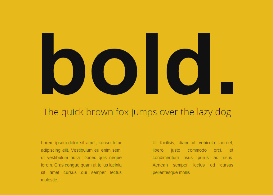
bold typography
Cinemagraphs
It incorporates high-quality videos or GIFs that works on a smooth, and continuous loop. Nowadays, it`s becoming a popular way to add movement and visual interest to other static pages. Full-screen loops, similar to the below example, are likely to hold visitors’ attention for longer than a quick glance.
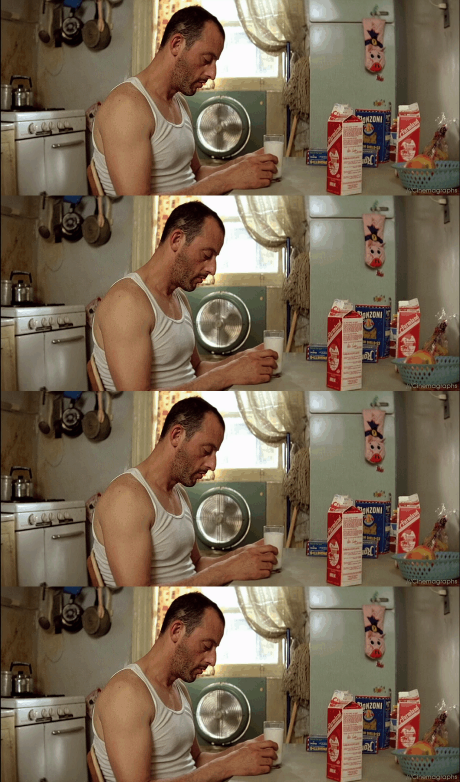
cinemagraphs
Experimental Compositions
Many designers are opting for composition instead for more eclectic structures in order to protrude in a sea of tiny Masonry style layouts. The below sample include this stunning collage of overlapping images.
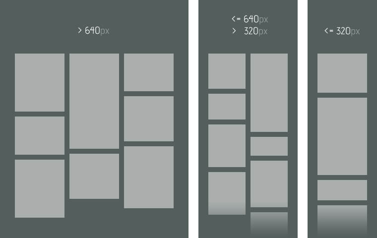
masonary style layout
Bright Gradients
The biggest evidence best website of 2017 is the new, upcoming trend of gradients. Kaleidoscopic gradients are up turning in a big way. An illustrated example of how to make this two-tone effect look fresh and modern, with their full-screen, gradient-washed homepage.
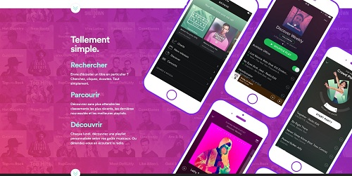
bright gradients
An Introduction Of Latent Semantic Indexing & Its Importance In Your SEO Strategy
Vivid Layers of Color
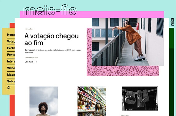
To dominate the world of digital design trend in 2017, an effective color scheme is an integral part of overall website design. Staggered, stacked layers of color add depth, texture, affecting your client’s bottom line in the form of conversions. Below you can find a stylish example of vivid layers of color.
vivid layers of colors
Straightforward, Simple Text
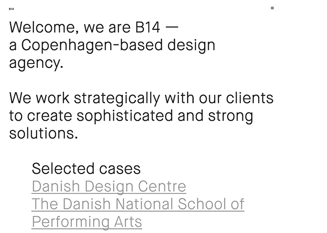
The simple text is also a powerful way to the aware user of your business. An increase in over-sized with dynamic text made writing sharper and easier for a user to read on-screen. A few choice lines of straightforward text to inform visitors about their company can grab the attention of the visitors more quickly than any other thing.
As shown in the example below, the design simply describes their mission statement and provide links to samples of their work. It’s a modern, uncluttered approach of presenting information.
straight forward, simple text
Illustration
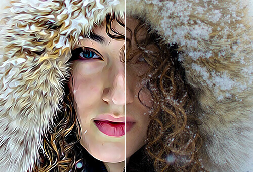
A lot of companies incorporates – illustrators and graphic artists for designing bespoke illustration for their website. Rather than flat design and minimalism, integrate illustrated touches to a site so that appeal audience and increase conversation rate. An example can be seen below:
Minimalism is a popular design trend included in 2017 web design. Minimalist web design only features content deemed necessary to attain user attention. It is hallmarked by lots of white space, fewer images (or even a single large image), and scarce text. Minimalist websites are clean, easy to read and understand and leave little doubt for your next step.
An example of Ultra-Minimalism site is centered below that is linked to social profiles and other informational sources.
illustration
Ultra-Minimalism
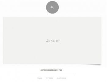
Minimalism is a popular design trend included in 2017 web design. Minimalist web design only features content deemed necessary to attain user attention. It is hallmarked by lots of white space, fewer images (or even a single large image), and scarce text. Minimalist websites are clean, easy to read and understand and leave little doubt for your next step.
An example of Ultra-Minimalism site is centered below that is linked to social profiles and other informational sources.
ultra minimalism
Modular Design
Modular web design trends are probably going to be a better option to opt in 2017. It incorporates a foolproof method to design – a clean, accessible website to engage visitors. This example below offers a twist on a modular design, as it gives an amusing ripple effect when you move the cursor over the dividing edges.
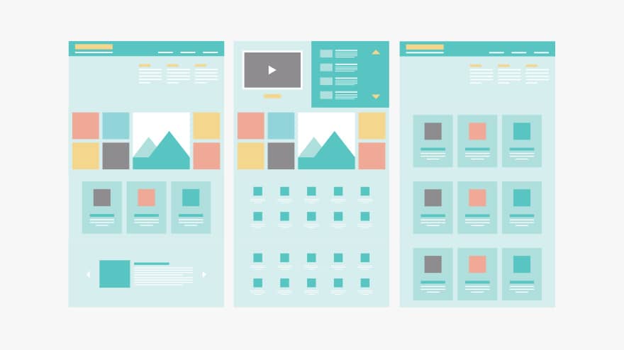
modular web design
Simple, Yet Effective Digital Marketing Strategies For Small Business
Mixing Horizontal and Vertical Text
Centering Content both vertically and horizontally on a page creates an overall ‘wow’ effect. View this example that includes horizontal and vertical text alignments on a simple page.
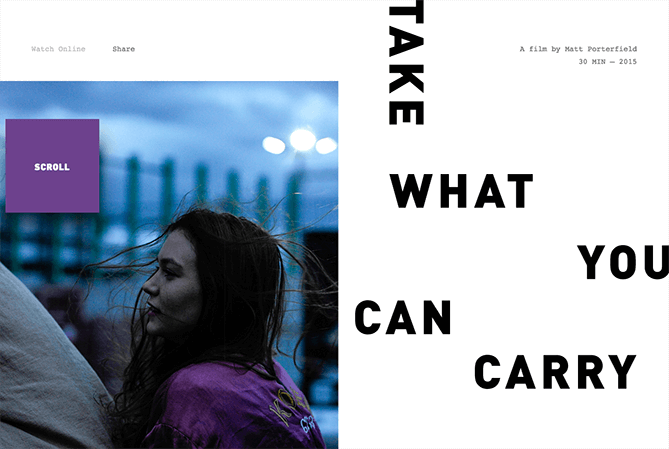
mixing horizontal & vertical text
Wrapping Up
Coming to the conclusion of our 2017 web design trends – Hopefully, this has introduced you to some new design concepts that you weren’t aware.
Have fun while designing your sites, but make sure whatever design you opt is not only trendy but also enhance the experience for customers.
To learn more about UX & UI design trends of 2017, request a callback!
Anchit Sood June 5th, 2017
* indicates required field

